A complete understanding of Linear and Logistic Regression
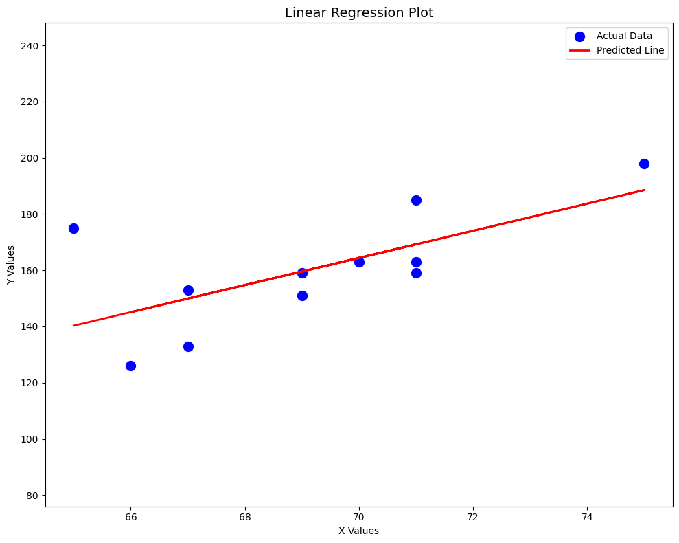
Linear Regression Model
What assumption do we have in Linear Regression?
The assumption that there is a relationship between Y (target variable) and X (features) Or simply: \(\hat{Y} = W_1X_1 + W_2X_2 + W_3X_3 + \dots + W_nX_n\) \(\hat{Y} = W^{T}X + W_0\)
Linear Regression predicts a continuous numeric value (e.g., predicting house prices, temperature, weight).
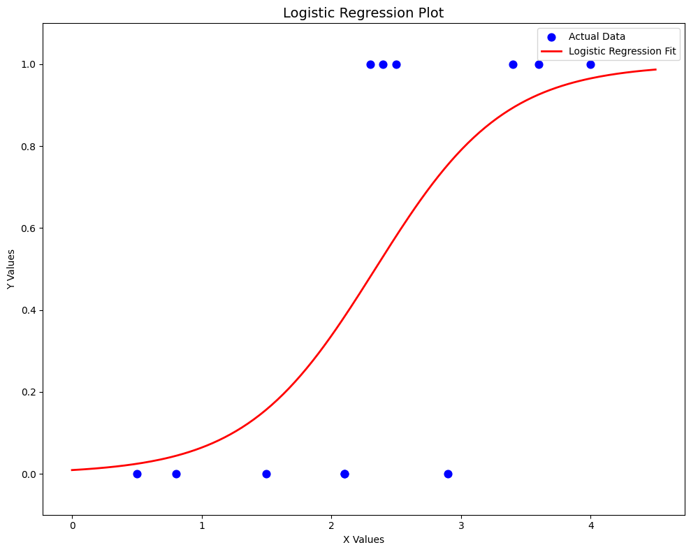
Logsitic Regression Model
What assumption do we have in Logistic Regression?
Logistic Regression assumes a linear relationship between features and the log-odds (logit) of the outcome.
\(W^{T}X\) \(P[Y=1 | X=x] = \sigma(W^{T}X) >> \frac{1}{1+e^{-W_1X_1 + W_2X_2 + W_3X_3+ \dots+ W_nX_n}}\)
Logistic Regression predicts a probability that maps to a categorical outcome (most often binary classification, like “spam vs not spam”).
The difference in short
Linear Regression predicts continuous values with a straight line fit.
Logistic Regression predicts probabilities for categorical outcomes using a sigmoid/logistic curve.
Linear Regression Code
Based on Example 12.6
import numpy as np
import matplotlib.pyplot as plt

x = np.array([65, 67, 71, 71, 66, 75, 67, 70, 71, 69, 69])  # Third Exam Score
y = np.array([175, 133, 185, 163, 126, 198, 153, 163, 159, 151, 159])  # Final Exam Score

mean_x = np.mean(x)
mean_y = np.mean(y)
sum_xy = sum((x - mean_x) * (y - mean_y))
sum_xx = sum((x - mean_x) ** 2)
b = sum_xy / sum_xx
a = mean_y - b * mean_x

yhat = a + b * x

#------Plots------#

fig, ax = plt.subplots(figsize=(10, 8))

ax.scatter(x, y, marker='o', color='blue', linewidths=5, label='Actual Data')
ax.plot(x, yhat, color='red', linewidth=2, label='Predicted Line')
ax.set_xlabel('X Values')
ax.set_ylabel('Y Values')
ax.set_xlim(min(x) - 0.5, max(x) + 0.5)
ax.set_ylim(min(y) - 50, max(y) + 50)

plt.title('Linear Regression Plot', fontsize=14)
plt.tight_layout()
plt.legend()

plt.show()

Logistic Regression Code
Based on Table 6.5
import numpy as np
import matplotlib.pyplot as plt

def sigmoid(z):
    return 1 / (1 + np.exp(-z))

x = np.array([1.5, 2.4, 3.4, 2.1, 2.5, 0.8, 2.9, 4.0, 2.3, 2.1, 3.6, 0.5])  # GPA
y = np.array([0, 1, 1, 0, 1, 0, 0, 1, 1, 0, 1, 0])  # 0 - No | 1 - Yes

a, b = 0.0, 0.0   # intercept, slope
alpha = 0.15      # learning rate
epochs = 1000

for _ in range(epochs):
    yhat = sigmoid(a + b*x)
    da = np.mean(yhat - y)
    db = np.mean((yhat - y) * x)
    a -= alpha * da
    b -= alpha * db
    print(f"a = {a}, b = {b}")

#------Plots------#

x_curve = np.linspace(min(x)-0.5, max(x)+0.5, 200)
y_curve = sigmoid(a + b*x_curve)

fig, ax = plt.subplots(figsize=(10, 8))
ax.scatter(x, y, marker='o', color='blue', s=60, label='Actual Data')
ax.plot(x_curve, y_curve, color='red', linewidth=2, label='Logistic Regression Fit')
ax.set_xlabel('X Values')
ax.set_ylabel('Y Values')
ax.set_ylim(-0.1, 1.1)
plt.title('Logistic Regression Plot', fontsize=14)
plt.legend()
plt.show()

Enjoy Reading This Article?
Here are some more articles you might like to read next: